Porta
Introduction
UX Design / UI Design / Fall 2021
Porta is an app designed to help you find any restroom at the click of a button. Not only does it find them, but it can differentiate between gendered and gender-neutral, single-stall and multi-stall, handicap accessible, family, or whether it has a changing room or not.
Tools used: Pencil and paper, Adobe XD, Adobe Photoshop, Adobe Illustrator
The Goal
The goal of this project in my UX design certification program is to create a dedicated app for social good. I decided to make an app to find bathrooms on a map after listening to some peers have a conversation about not being able to find any bathrooms that will accommodate them and their needs. This got me thinking, how can I create something to help them find their needs? I was then able to come up with the goal for my app: to find bathrooms that accommodate the user and their needs.
My Role
I became every role in the UX design process as the lead UX designer and researcher.
Empathize and Define
I began by conducting interviews with 5 people who use public restrooms regularly and assess their pain points to build empathy maps and user personas based on their needs. This helps me to understand their journey as a user and their needs as a human. I came up with three major pain points when it comes to finding bathrooms that fit their needs: the need for gender-neutral, handicap, and family bathrooms/bathrooms with changing tables in them. I then conducted a competitive audit for similar apps and websites, both direct competitors and indirect competitors, to see what they were doing correctly and what they could be doing even better that I can implement into my designs.
Competitive audit
Ideate
I began with the sitemap to get the design architecture down. It is important to know what pages your website will have for the main user flow before beginning the sketching and wireframing phase. After the sitemap was done, I started on the sketches and began making the dedicated mobile app design first to then work my way up to tablet design and eventually web design.
Sketches and Wireframes
Research and User testing
After sketching the first wireframes and creating the first digital low fidelity wireframes, I began my user testing to see if there were any challenges in the main user flow that needed to be fixed. I gave four people a monitored usability study that lasted only ten to twenty minutes and took notes on how they interacted with the design and their user experience throughout exploring the low fidelity prototype. I learned a few insights through the feedback from the user study, and I prioritized them from most important to the user flow to least important. The most important pain point was that participants found the drag screen at the bottom to be particularly confusing, they did not know how to interact with it. The second priority pain point was that they were confused as to why the menu option and the search option were so close together. I fixed both of these issues by changing the drag screen action to tap screen and sharpened the edges, for the next pain point I sent the menu to the left side of the header and kept the search option to the right, putting the logo in the middle of the header.
Mockups
-

Before and After
Although a little blurry, you can see the transformation from wireframe to mockup after its usability study
-

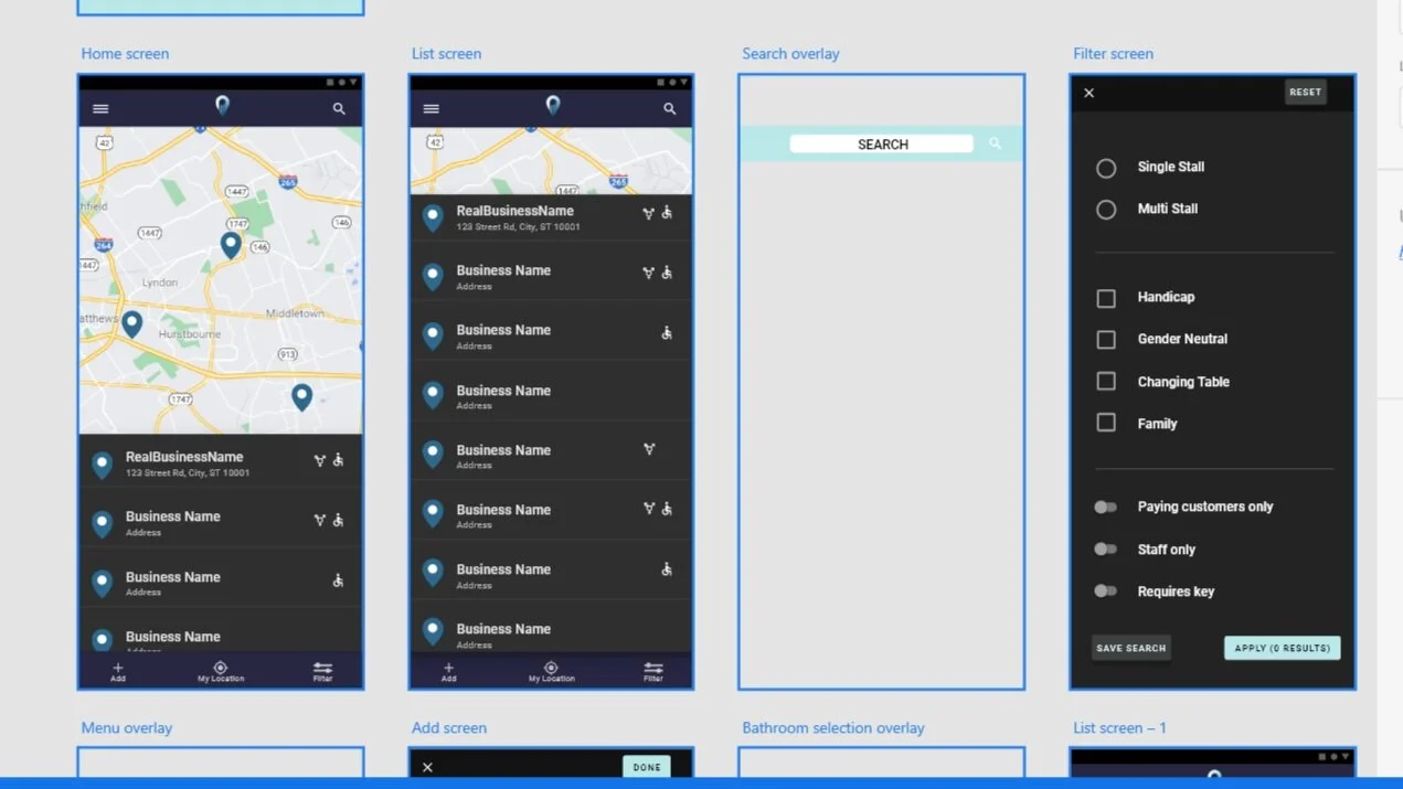
Mockup
I decided to use Google’s dark theme design system to help establish a good and consistent design throughout the entire mockup
Prototypes
With the feedback I was given, I was able to create a smooth prototype using high-fidelity mockups. Check it out in the button below to see the polished designs!
Final Polished Designs
Results and Outcomes
Every project I take on helps me to grow as a UX designer. This project helped me to hone my skills in Adobe XD and realize how helpful user testing and feedback are to developing a beautiful UI design as well as an enjoyable user experience. I learned how to show off my mockups in an isometric pattern and how to use design systems to keep my work visually appealing and consistent. Thank you for your interest in my work and I invite you to check out my other projects.


